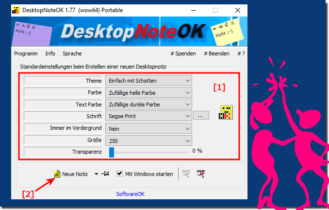
The main window does not change because the transparency slider is the default value for the next desktop note!All values and settings are the initial values (standard, default) which are then used when creating the next Windows 11, 10, ... etc. desktop note and do not relate to the main window, but the desktop note can also be adjusted subsequently in the respective desktop note! Content: 1.) ... default for the desktop notes!
|
| (Image-1) Windows Desktop Desktop Notes Preferences! |
 |
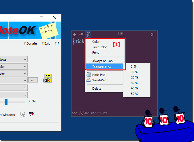
2.) Desktop note display, color, transparency in the desktop note!
The display and transparency can be changed at any time!
(... see Image-2)
It appears that the transparency of the main window does not change when the sliders are moved because the default values are set for the next Windows Desktop note. These values remain unchanged to ensure a consistent user experience. They serve as the default for all new desktop notes that are created.
It is important to understand that these presets are just a starting point and are not specifically applied to the main window. Rather, they are applied to the next desktop note that is created.
| (Image-2) change the sticky note color in the window plus transparency! |
 |
Desktop note display, color, transparency in the desktop note for Windows 11, 10 , 8.1, 8, 7: Pro, Home, Enterprise, Basic, Premium, Professional, Starter, Ultimate, Windows-Server 2019, 2016, 2012
3.) Further thoughts and considerations about desktop note display, color, transparency!
When designing and customizing desktop notes, several aspects should be taken into account, especially in terms of appearance, color and transparency:
1. Readability and contrast:
Readability is crucial to easily grasp the information on the desktop notes. Therefore, it is important to choose colors with sufficient contrast to ensure that the text is easy to read, especially against different background images or colors.
2. User Settings:
Color and transparency customization options should provide users with enough flexibility to suit their personal preferences and needs. Some may prefer light colors with high transparency, while others may prefer darker colors with lower transparency.
3. Integration with Desktop:
Desktop Notes should fit harmoniously into the desktop environment. This means that colors and transparency should be chosen so that they do not appear distracting or block the view of other desktop elements.
4. Functionality and Purpose:
When designing desktop notes, you should also consider the purpose and functions you want them to fulfill. For example, if notes are intended to serve as reminders, a bolder color or greater transparency can be used to attract the user's attention.
5. Accessibility:
When designing color and transparency, it is important to also consider the needs of users with visual impairments. Using color schemes that are compatible with accessibility standards and the ability to adjust transparency can improve accessibility.
6. Consistency and Branding:
When desktop notes are used in a business environment, it may be important that they reflect the company's corporate design or branding. This may mean that certain colors or styles need to be used to ensure a consistent display.
7. Technical Limitations:
It is important to note that not all users have the same technical skills. Some older systems or software versions may not support sophisticated transparency effects or color adjustments, so alternative solutions should be considered for broader compatibility.
By carefully considering these considerations, desktop note-taking can be designed effectively to improve the user experience and achieve an optimal balance between functionality and aesthetics.
FAQ 10: Updated on: 14 April 2024 12:16
